Graphics can lie to you
If you want to persuade people, display the data in a chart! Charts are great for taking complex, hard to understand data sets, and creating a visual representation of the data that is easier to interpret. However, honesty is crucial when converting numbers into a chart. The hucksters of the world have found all sorts of magic tricks to lie with graphs. This section will point out some of the more egregious methods.
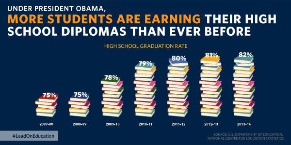
If you want to persuade your audience that something significant has happened, but your data won’t cooperate, what is the charlatan to do? Expand the scale. You can make almost any chart look like something important has happened if you mess with the y-axis. Look at this chart that was published by the U.S. Department of education (Figure 2.2)
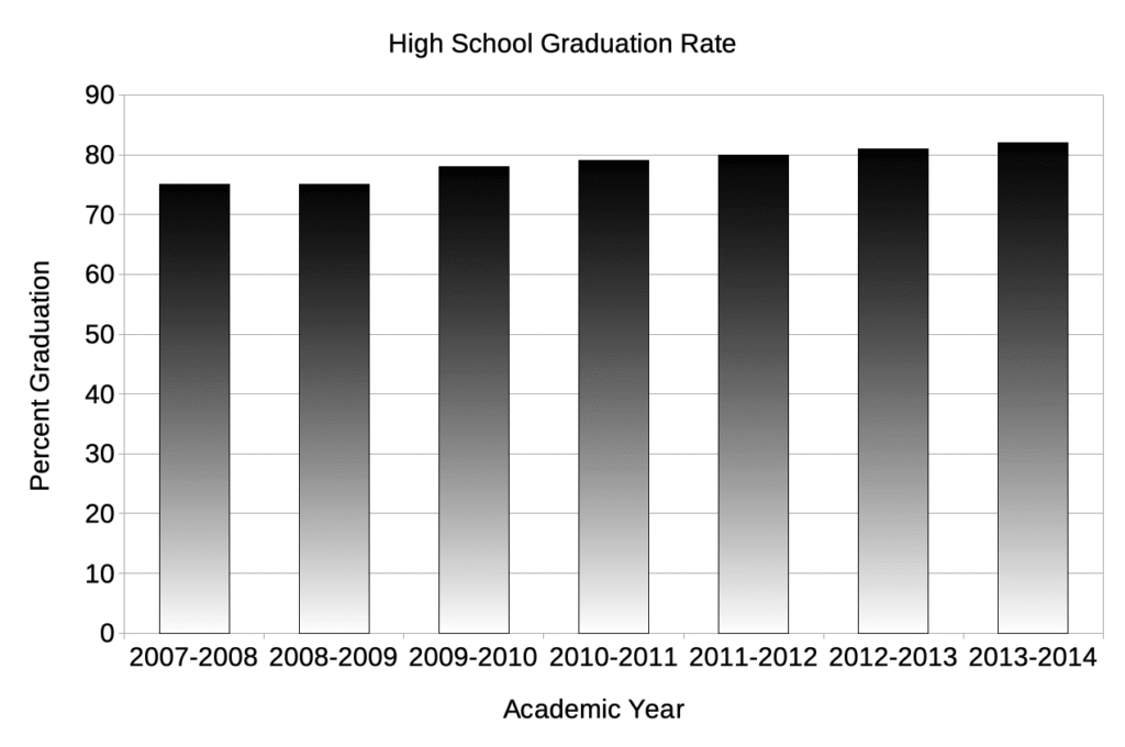
First, this type of chart is ascetically pleasing. Look at all those beautiful books, and it’s about education, fancy! It sure looks like there has been an enormous change in graduation rates during President Obama’s time in office. However, the scale doesn’t make any sense. If five books represent 75%, then that is 15% per book. The 2013-2014 stack represents 82%, and that should not be even one more book. Figure 2.3 is a more accurate representation of that data.
Another fun trick to prove a point is to compare the number of some behavior without normalizing for population size. For example, murders in the United States. If a politician wanted to make Chicago look bad, they could report the total number of murders in each city (Figure 2.4). Chicago’s homicide problem seems twice that of any other city listed. The leadership in Chicago needs to change! Or does it?
Unfair comparisons by ignoring population sizes
In this chart, the scale starts at 0, and while there is an increase, it is not nearly as big an increase as in the first chart. While there has been some movement, it is incremental, laudable, but incremental.
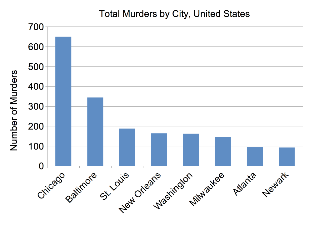
So what’s the problem? These cities are not the same size. In fact, Chicago is much bigger. A fairer comparison is to examine the homicide rate per 100,000, as that takes into account the population of each city (Figure 2.5).
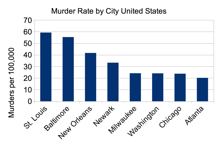
As you can see, while all these cities need to decrease their murder rates, Chicago does not have the biggest problem. In fact, it is not even in the top five.
Hiding things you don’t want people to notice
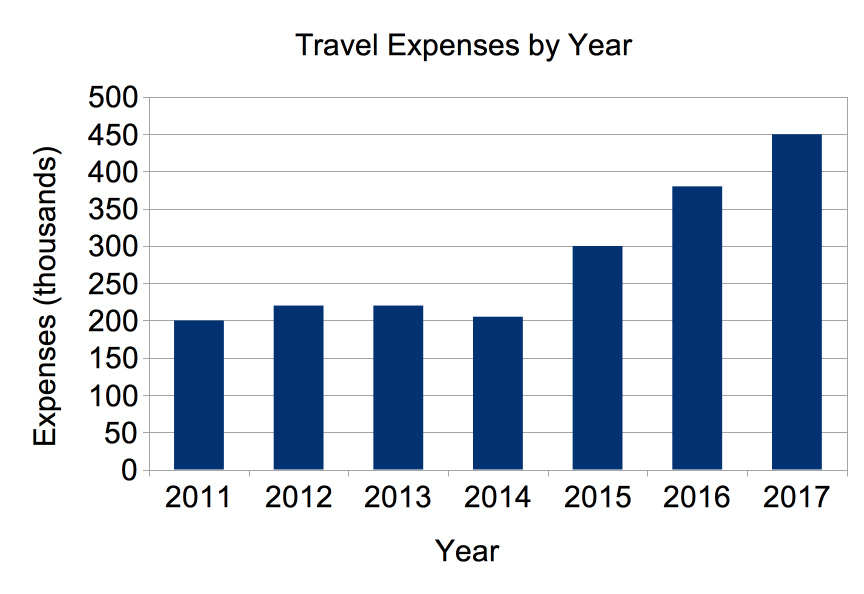
Ever have an unpleasant fact you needed to report to your boss? Did you spend too much of the budget on travel? You have to report the expenses of the department. Even worse you took over the travel booking in 2014. If you were honest, you might create a chart like this and take the wrath of your boss and maybe get fired.
Or you could hide the travel expenses within the entire budget and present a more opaque graph.
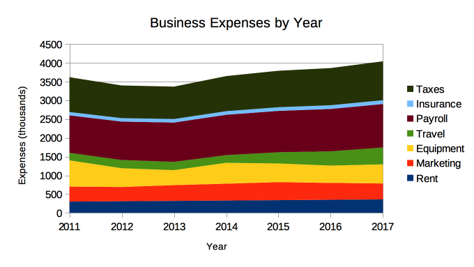
You are still reporting the expenses of the business. You have just hidden the increase in all the other expenses of the business. The costs of running the business have increased $315,000 and 80% of that increase is in travel expenses, but it is much harder to see in the second chart.
Abuse of charts
Some folks simply love all the amazing things their graphing program can do. They can add volume and perspective. They can highlight certain aspects. Graphing programs give the user tremendous power in how the data is displayed. Unfortunately, users sometimes ignore all chart making conventions and do whatever they want to make a point. The graph in Figure 2.8 is a simply breathtaking example of chart abuse.
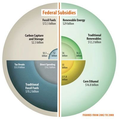
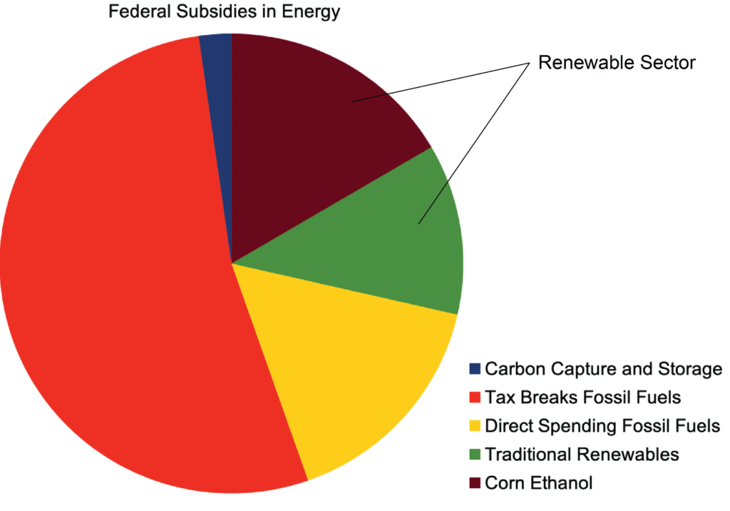
Figure 2.8 doe does not come close to displaying a clear picture of where energy subsidies are going. It clouds the point, and this was probably done on purpose to obscure the money going to the fossil fuel industry. The “pie chart” shown does not clearly portray the proportion spent in each area, and the purpose of the subsequent inner figures is not apparent until you realize that they are breaking down each quadrant. If your reader has to work this hard to understand your chart, you have failed. Figure 2.9 shows a more accurate display of the data.
There are more ways you can cheat with graphs, but you get the picture; it is easy to be dishonest with statistics and graphs. If any of these considerations make you suspicious of an article, run! These tactics are the purview of charlatans and con-artists.
Correlation does not mean causation
Confusing correlation with causation is a common problem. Many people make the mistake of thinking that if two things occur at the same time, one must have caused the other. An amusing example of this is baseball players and their superstitions. Mark Teixeira of the New York Yankees before a game accidentally put on one of CC Sabathia’s sock when it had ended up in his locker. He didn’t notice until the game started that he was wearing one sock with a 25, and one sock with a 52, Sabathia’s number. That day he hit two home runs and had six runs batted in, a very productive day. From that point on, Mark has worn two different socks. I am sure even Mr. Teixeira knows that this has nothing to do with his skill as a baseball player, just as you know that wearing your team’s favorite colors isn’t going to make them play better.
A more serious, health-related example is the classic study by Armstrong and Doll that compared incidence rates for 27 cancers in 23 countries to the diet in those countries. Correlations were seen between colon cancer and meat consumption and between fat consumption and breast cancer. While these studies were the first to show trends in the rate of cancer and a particular diet, it was only a correlation. It took decades of work to find out why meat consumption increases cancer risk and fat consumption breast cancer risk. This work continues today.